
According to Chris Creamer of SportsLogos.net, the Maple Leafs are expected to unveil both a new logo and entirely new uniforms in time for the 2016-17 season, which will be their 100th as a franchise in the National Hockey League.
It’s all just part of the Leafs’ plans to go all out in celebrating their centennial season; a series of throwback jerseys is also in the cards which would, at the very least, include a re-appearance by the green Toronto St. Patricks uniform from the 1920s.
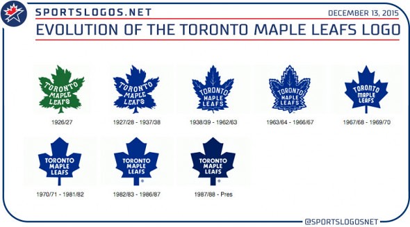
After evolving their logo steadily throughout the 43 years following their adoption of the “Maple Leafs” name in 1927, the team has made only very minor changes to their logo in the 45 years since. Introduced in 1970, the current Leafs logo sharpened its corners and plumped up a bit in 1982, then darkened its blue for 1987.
If MLSE is considering a logo that doesn't look exactly like one of the ones shown above, I only have one thing to say to them:
Don't.