
I should have taken a screen cap of every design this site has had. I now do that, but from 1999 through 2007, all I have is what was archived by the Wayback Machine.
I just visited the Wayback Machine in an attempt to salvage screen caps of the evolution of this site. Here's what I came up with, for better or worse. Vote for your favourite in the comments.
1999-2001
The earliest instance of torontomike.com I could find in the Wayback Machine was early 2001, when this was a personal homepage as opposed to a blog. It would become a blog in 2002.
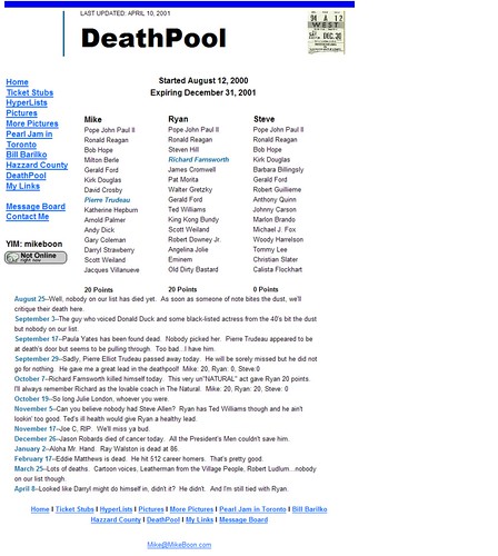
The Wayback Machine didn't properly copy the images, so this looks a little off. Note, the tributes to Bill Barilko and Pearl Jam in Toronto are already online. Those pages have survived to this day.
Hazzard County, however, was taken out back and shot about a year later. Yee haw!
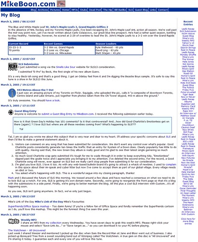
2002
The Wayback Machine really mucked this one up. None of the images came through, and the CSS seems AWOL. Still, you can see the structure as it once was.
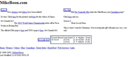
The familiar Leafs table is already in play. The Canadiana page, however, has disappeared.
A link to the blog is now in the navigation menu, but it's not yet the home page. In 2003 I wisened up and made the blog index.html.
2003
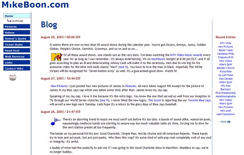
I really liked this design. You'll see in the main navigation menu that I've introduced the Homer Simpson Quote of the Week. I updated that page every weekend for years. I've also introduced the Links page, which you'll find in the main nav menu today. Every time I try to remove it so it's only accessible from the site map, somebody complains, so I put it back.
The dot missing above the "i" in that torontomike.com image was a red maple leaf that blinked. Animated gifs, people!!! You had to have an animated gif in 2003!
The little image that appears in every entry was something I did from the start, after seeing something similar on Slashdot. By this point, every piece of markup is done with CSS. Note, this is the blog, but there is no server-side software managing it. This was an HTML file I manually edited and uploaded via FTP. Hence, you can't comment and there are no permalinks.... yet.
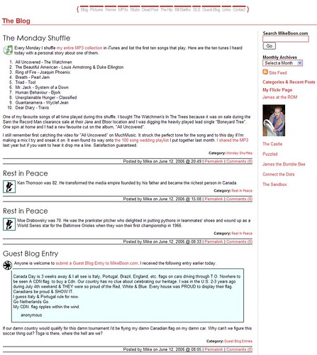
2004
It looks like I took a rest from Verdana and tried Georgia for a while. I also moved the nav from vertical to horizontal across the top... although I see the Wayback Machine isn't showing the proper markup. I assure you, the menu looked better than this.
Otherwise, this is pretty similar to how it looked in 2003. I have, however, introduced the MP3 page, where I listed every album in my collection. This wasn't a manual process as I found a script that would auto-generate the HTML based on the TXT file produced by Audiograbber after I ripped each CD.

2005
What's with that creepy eye? What was I thinking?
This design looks like 2003 and 2004 mated. Before I implemented Movable Type, there was one HTML page for every month, so the page would get awfully long. I think this particular page went on for a million pixels.
2006
Ladies and gentlemen, I give you Movable Type. The blog is now a true blog, with RSS, comments, permalinks, searchability, category archives, monthly archives and more. Again, I went with a "less is more" design, and I like it.
By the way, after I introduced Movable Type in early 2006, I had to manually put all the old entries into the database. That was one time consuming copy and paste job.
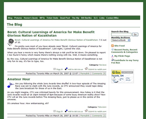
2007
The Wayback Machine lost my header image here... maybe because it came from the CSS. I kind of like the sidebar here in the pre-Adsense era.
I eventually blew away that weather widget because when that service went down, the loading of this page would go on forever.
I'm also experimenting with social networking chicklets... I eventually shot them dead and went with the Feedflare from FeedBurner instead.
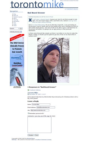
2008 Part 1
This was the last major redesign before the one this week. I really liked it.
The header image was inspired by Spacing. I actually asked them for permission before I used it.
2008 Part 2
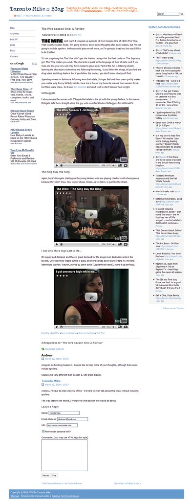
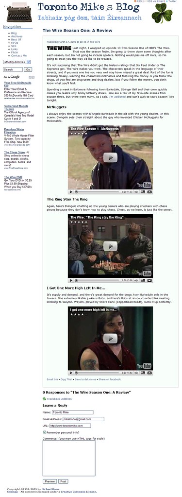
This is how this site looked on St. Patrick's Day 2009. Heck, that was only a few days ago.
I was happy with this design, but I needed a third column for Tweets. Since I was mucking with the HTML, I decided to blow it up and start from scratch. Truth be known, I took the March break off to chill with the family, and while they were at playdates, my idle hands became the devil's playthings. This site didn't stand a chance.
2009
Here's where I'm at as of the time of this entry. You guys gave some good feedback, which resulted in some tweaks I believe improved things. That Twitter sidebar needed a background colour so the eyes didn't blend it with the main content, and the header needed an image for a splash of colour and something less boring.
I'm now happy with this. This should stick until my next week off, sometime in July.