I Like thestar.com Redesign

Published October 19, 2009 @ 13:08 in News, Toronto News ~ Toronto Focus

newspaperThe Toronto Star recently redesigned their website. Here's a screen cap of their current Sports page.

thestar

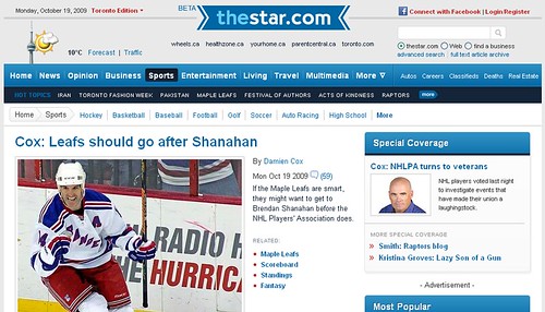
I like it. It's clean and simple, and content is king. I like their use of white space and padding. It's definitely an improved site.

It's tough going for the newspaper industry. Their web presence is so vital and none of us want to register to see the content let alone pay for it. Monetizing online content isn't easy. Sure, if you get eyeballs you can sell ads, but imagine trying to support an entire news organization like the Toronto Star with online ads.

Then there's guys like me who never see the ads. The reason you see no ads in the screen cap above is because I surf the web with Adblock Plus added on to my Firefox web browser. I haven't seen an ad online in years.

Still, you've got to have a good web presence, and this redesign is a good one.

16 Responses to "I Like thestar.com Redesign"

Ajax Mike
October 19, 2009 / 14:57

It looks good, but I find it loads very slowly in IE at work. Alas, I have no choice in my browser at work.

Pete McPhedran
October 19, 2009 / 15:04

I agree, the new Star site has a better layout.

I hate the CTV.ca redesign though. I actually gave up on trying to find articles there, the old site was better!

--Pete

CQ
October 19, 2009 / 15:05

For me it is a large [opposite of] improvement. Some of reasons, which no one cares/d aboat:
1) main page(s) no longer reveals the writers' names with article summaries.
2) crashes my browser frequently vs. never before. Requires me to hit the stop button during page loading.
2a) doesn't forward thru to comments for me - same as G&M's redesign earlier this year.
3) too much wide spacing along top portion. Some pages will appear with two tones of black until further page loading.
3a) too much white spacing in general (IMO).
4) still no 'real' ads! Often I prefer to see the context of its content. That is quite different from the fixed idea of 'web media specific' ad space. I wrote a blog entry earlier in the year further detailing this - using the Sault Ste Marie newpaper's page in the comparison. That entry, however, was deleted after a few months.

Toronto Mike
October 19, 2009 / 16:22

This IE issue sounds serious.

I manage a software company's site and see that 73.52% of the traffic still comes from IE. As much as IE sucks, it's the most popular browser by a pretty large margin.

thestar.com has to work effectively in IE.

Andrew
October 19, 2009 / 16:23

Funny you should post this Mike. I just sent a lovely email to the feedback email telling them how I much I hate the redesign. Here's what I wrote:

I sent an email last week to your feedback comments mail to say how disappointed I am with the new ‘look’. This email is to inform you that I’ve given up entirely on the site – on all devices I own. I travel for business a lot and TheStar.com was my home on the two desktops I have, 2 laptops, BlackBerry and iTouch I own. As of today, I have removed TheStar.com from their place as my home page. Your site now takes way too long to load, is cluttered and inefficient.

I’ve give up entirely on my BlackBerry and I am now only viewing your site on the itouch app.

As someone who visited your site up to 20 times a day – I am a news junkie and work in television – I have given up.

Just thought you’d like to know.


I can't STAND the new design for all the reasons above.

Love to hear what others think.

Cheers!
Andrew

Toronto Mike
October 19, 2009 / 16:45

Very interesting. I love how different people can have completely different reactions to such things.

Who else wants to chime in on the Toronto Star web redesign?

Toronto Mike
October 19, 2009 / 17:34

Also, it's interesting I chose this screen to cap. Damien Cox says the Leafs should sign Brendan Shanahan.

I said the same thing on the weekend: http://twitter.com/torontomike/status/4966741934

Horonymous
October 19, 2009 / 17:43

Lived through the other redesigns at thestar.com and always saw improvement.


The current redesign is made life more difficult IMHO.

Where to start... horrible, way more clicking, scrolling, hunting for stuff, takes very long to load, I like to have the article on the same page as the comments.

Have these "improvements" been made to increase page views?

Do not visit thestar.com as much as in the past,

Only thing I like is the timeline view.

Ben Vidal
October 19, 2009 / 20:02

Hey Mike,

I was talking to my friend about this on the weekend. We both can't stand the new site redesign. I used to check up on the news on my phone and could load the old site no problem. Now I don't even bother. Talk about how long it takes to scroll down to the bottom of the page. Website design 101 always told us that pages should be kept screen width and not be able to scroll down forever. Needless to say everyone else who has a problem loading it on IE, it's what my work uses. I don't like the feel it's too cartoonish. As for getting to the comments page what a pain. The old page you could see where the market stood at the side without feeling lost and who cares if there is a picture for every article half the time the pictures aren't from the article they throw up some background garbage that I don't need to see. If I wanted a comic book I would pick up the sun.

felix
October 19, 2009 / 20:20

I wonder if Damien is following you on Twitter, Mike... that's an eerie coincidence.

Brian
October 19, 2009 / 21:05

The bad reviews here are pretty typical whenever a popular site redesigns. People hate change.

I agree with you Mike, I like the cleaner more airy design as it allows me to scan the content more easily, and the addition of visual, grid, and timeline views are great options too.

I tested it in IE and had no problems with load time whatsoever.

elvis
October 19, 2009 / 21:11

I've stopped going to the site since the re-design. It's horrible.

We know you think the same way Mike - you just have to take the other side so you generate comments and traffic. ;)

Argie
October 19, 2009 / 21:12

It doesn't matter how they redesign the Star, its still a lousy liberal rag. Way too one-sided and of course on the wrong side.

Gary
October 20, 2009 / 06:35

Whether it is better or not doesn't matter too much at this point.....like many others...it really takes a long time to load in IE. So I stopped going to it.

Mike from Lowville
October 20, 2009 / 08:50

I love it JUST because Argie hates it! Loads fine in IE for me. Like Brian says, people hate change.

Leave a Reply


« Maple Leafs 1, Rangers 4 Pixar Intro Parody »