Bring Back the Old Blue Jays Logo

Published by Toronto Mike on September 29, 2007 @ 15:46 in Toronto Blue Jays

bluejaysYes, I realize this is my third sports-related entry in a row, but whatcha gonna do? It's all about me, remember?

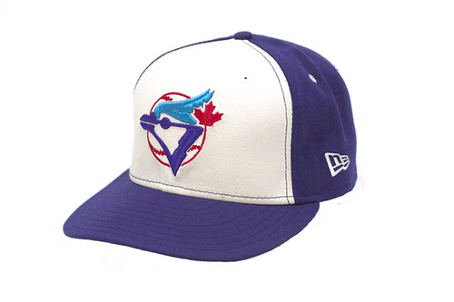
I officially despise the new Blue Jays logo. My brother gave me a gift card for the official Blue Jays store and I've yet to use it because every item has that damn soul-less logo plastered on it except for two styles of retro fitted caps. I don't like fitted caps. Further hunting reveals a Cooperstown jacket with the old beloved logo on it, but it's $110.

What exactly was wrong with that sharp looking double blue blue jay over top the baseball with our red Canadian maple leaf prominently displayed? Was it too Canadian? Too associated with success? Too popular?

The new logo is starting to seriously piss me off as I pang more and more for the old logo. There's power in numbers and it's time we did something about this. It's time we bring back the old Blue Jays logo.

Retro Jays Hat

Permalink Entry Permalink Comments 33 comments

33 Responses to "Bring Back the Old Blue Jays Logo"

Mike (Buffalo Boy)
September 29, 2007 / 17:13

I agree with that mike, look what happened to the Sabres when they decided to start bringing back at least a semblence of their old colors. It brought a brand new sense of the glory days of the franchise. ...I am not in love with the newer uniforms either. I don't hate them as much as you do, I can live with them but....They look too much like Tampa Bay. We need the old uniforms back because they were unique...

Kathleen
September 29, 2007 / 18:41

I feel the same way about the Sabres logo.

Mike (Buffalo Boy)
September 29, 2007 / 21:56

I like the current logo for the sabres.

Megan
October 1, 2007 / 13:01

I agree! The old logo is the best. We need to have the maple leaf back in there. The black and silver thing was done way back in the 90s (think Raiders). Double blue and red please!

Jason | GetYourOJ.com
October 1, 2007 / 13:56

I'm a nostalgic type a lot of the time but sorry, now that I am used to it I think the new logo is an improvement. At least it looks more like a bird.

PJ
October 1, 2007 / 19:19

Wow. That takes me back.

Although I must say, their marketing has kicked but since they got this latest new logo.

Steve
October 7, 2007 / 23:00

You got it right...Mike! Other than the millions of dollars made from merchandising, why would you mess with success. Please note we haven't been in the playoffs since we got rid of the original logo. Can you at least get rid of the black so we can be the BLUE jays again!!!! PLEASE...PLEASE...get rid of the BLACK!!!

CJ
October 14, 2007 / 06:20

I'm a huge Jays fan from out in California...vacation in the Muskokas every summer and want to know where to buy my old favorite hat...all blue!

Thanks!

Jason
January 5, 2008 / 02:51

does any of these faithful jays fan know where i can buy a hat just like that one up there still? thatd be amazing

Toronto Mike
January 5, 2008 / 18:28

Jason, they're all over the place. I almost bought one last summer. I know the official Blue Jays store sells that retro hat and I've seen it at other sporting goods stores.

Heck, I saw it at Square One the other day...

ChristineT.O.
March 13, 2008 / 02:46

Even looking at the old logo makes me sad because I remember how good the 90s were!! I WISH they would bring back the old logo.. it was original and really identified us. Now it looks too much like we're trying to fit in with the rest of unoriginal team logos. Keep it classic!!

Chris
June 4, 2008 / 17:34

What can we do to bring back the old logo for good? The Blue Jays asked a marketing firm whether they should bring back the old logo or pay the marketing firm lots of money to come up with a new logo. Hmmm. . . I wonder what the marketing firm is going to pick?

Bring back the old logo for good!

johnny
June 7, 2008 / 09:20

The old jays logo is much better then the new one

Richard
July 22, 2008 / 08:35

I really like the new logo, but agree with the issue with it being on a black background. I think it would look really good on white. For example, the cap above would look really good with the new logo and a red front.

Cory
July 24, 2008 / 18:16

I compltley agree! i can stand the new ones. Its not the Jay's anymore. I'm hoping maybe with Cito Gaston back they may go for a nostalgia trip and bring them back.. When i was younger i had found a unique hat it was the original blue Jays Logo on a black hat. That maybe the nicest way to go black or gray uniform with the old logo would be great!

Brian
September 8, 2008 / 00:31

I love the original logo but the one from 1997 was nice as well. I didn't like the change on that one, but in retrospect it looks just as good if not better! The new one stinks, however. So did the one with the large T behind it. Looked like a Texas Rangers hat with a steroided blue jay mutant in front of it.

johny mo
September 9, 2008 / 18:12

I dont know why for the last 10 to 12 year the blue jay's keep changing there crappy unis and logo when the origional one was the best..they had success won a few world series and had a winning tradition and then all of a sudden they want to change everything like they have an identy crisis or something. One more point to mention why do they have black unis when they're team is called the blue jays..Please go back to the origional

Jay
January 15, 2009 / 23:42

Hey, just wondering if anyone on here knows where i would be able to find one of the old jays hats, the one with the classic logo, but blue cap with the red beak. Been looking absolutly everywhere but cant seem to find any

James
March 10, 2009 / 05:30

I agree - bring back the original logo, it's a classic!

anthony
March 29, 2009 / 19:57

Try Lids.com
They have an overwhelming selection of Blue Jay hats - from fitted to easy fit to stretch. ONly problem is the shipping is ridiculous!

I already checked in Lids stores in Ottawa and they don't have as much variety as the website offers.

The old logo was def "mint" and it was unique and canadian.

Anonymous
April 30, 2009 / 14:32

they have to change this crap uni, they're the blue jays, not the black jays. Super dumbass marketing firm, there was nothing wrong with the world series winning uniforms, how do you have continuiety with the traditions of when you were a winner when you present this total change. Just done by a ridiculous Rogers company that has no idea how to build class and tradition.....

Anonymous
April 30, 2009 / 14:35

How can we change this en mass, I would love to see the old ones back. Double blue....They, along with the diamond backs and the rockies, are the worst of MLB

Anonymous
April 30, 2009 / 14:40

The great orginizations, like the Yankee's, Red Sox's, Tiger's, who after all have classic simple uniforms, don't change to be whimsicly after a non baseball fan. There uni's stand the test of time and thats what makes them great. Same for all great franchises in all sports. The originals were a great start, granted they could be tweaked, but not completely overhauled and black. I see more and more people wearing the old logo anyways, I can't imagine the new one has been that sucessful at market either.

jose gallegos
December 15, 2009 / 16:52

i feel the same way as u mike im a huge blue jays fan up in california, to but i want to know were do u buy all the old blue jay stuff

jose gallegos
December 15, 2009 / 16:53

i feel the same way as u mike im a huge blue jays fan up in california,but i want to know were do u buy all the old blue jay stuff

Andy
May 9, 2010 / 04:18

The Blue Jays need to bring back their old logo and ditch that stupid new one. I wish they'd hold a poll on their website and actually listen to their fans!

Blue
June 8, 2010 / 00:09

Bring back the original logo you bastards!!!

Derek Loseth
April 8, 2011 / 15:29

Man, I'm glad to see others hate the new logos. I seriously think the original is one of the greatest baseball logos of all time, we demolish it?! I only wear blue jay memorabilia if it is the original, the real logo.

Tom Bradford
May 30, 2011 / 01:23

Love the old logo...hate the new. Why did they mess with perfection?

Tom Bradford
May 30, 2011 / 01:23

Love the old logo...hate the new. Why did they mess with perfection?

michael king
August 5, 2011 / 17:48

i would love to see the old uniforms back but the greedy rogers family probably sell alot of jerseys to urban areas because of the dark colors and its all about merchandising unfortunitly.

Mike Jackson
August 21, 2011 / 14:46

^^^"Urban" areas? "Urban" kids don't buy baseball jerseys... since the 90s. Plus the Cooperstown/old logo in fact sees higher sales in caps (New Eras in custom colors mostly) than the new logos. Source: living in "Urban" Toronto

Leave a Reply


« John Paciorek's Game Was 44 Years Ago Today Kevin Everett's Miraculous Recovery »